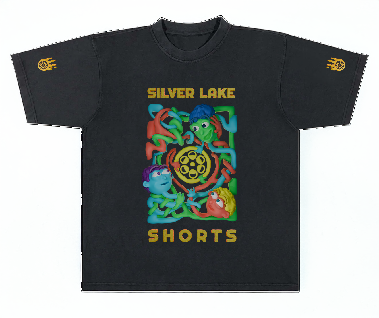
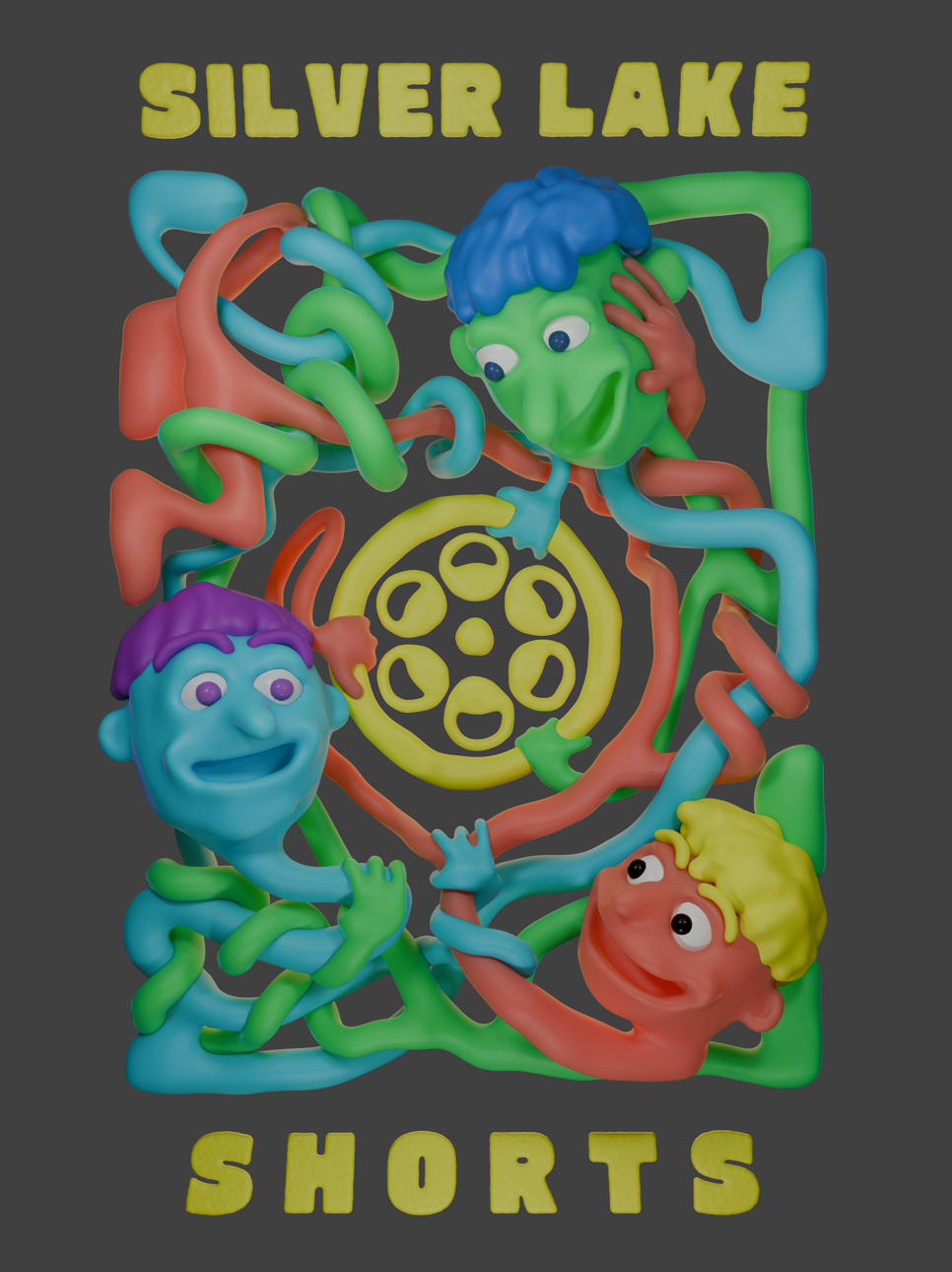
Silverlake Shorts
Hug T-Shirt Design
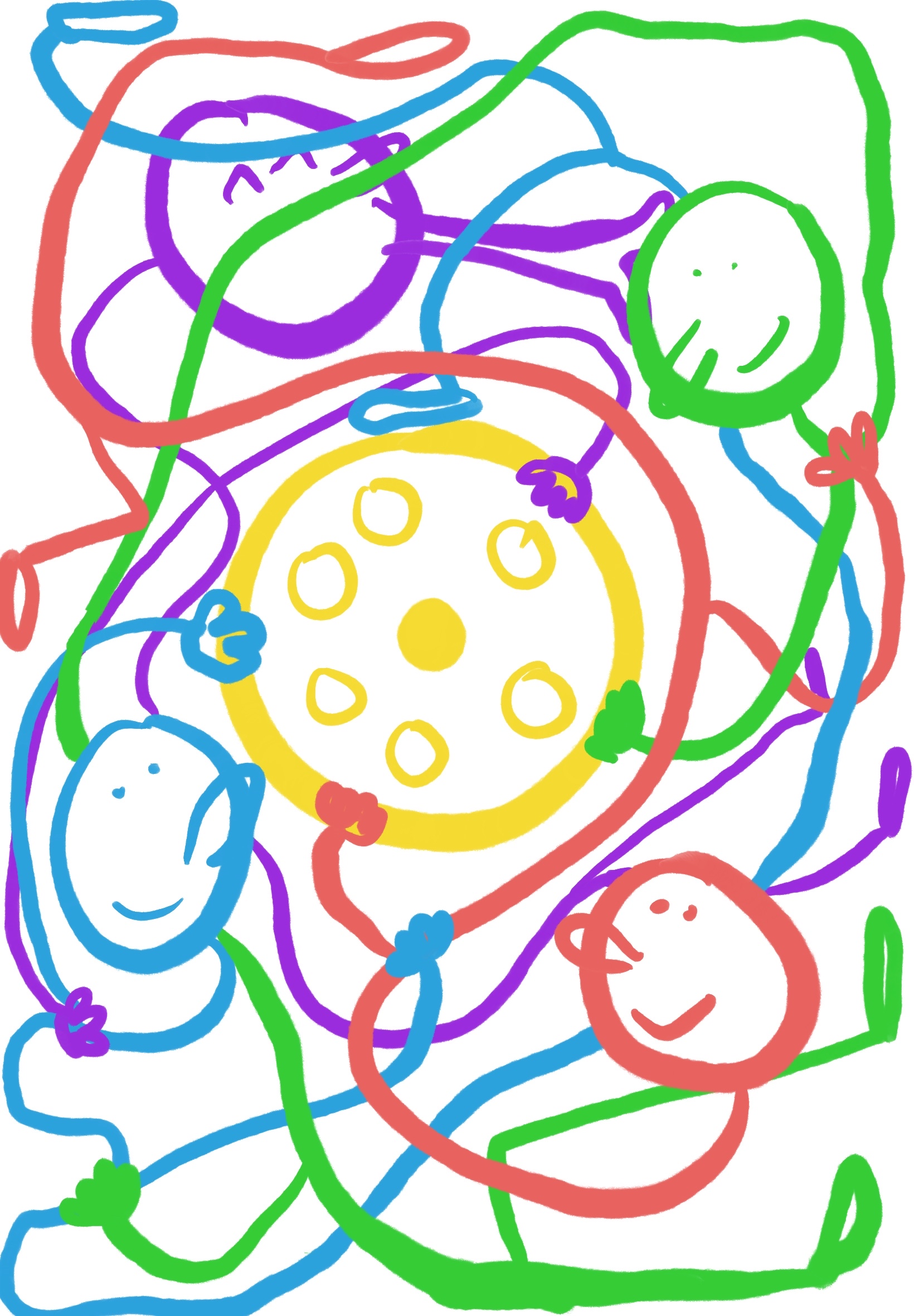
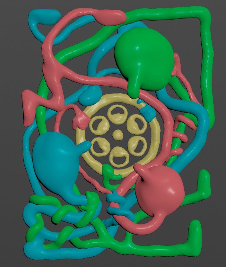
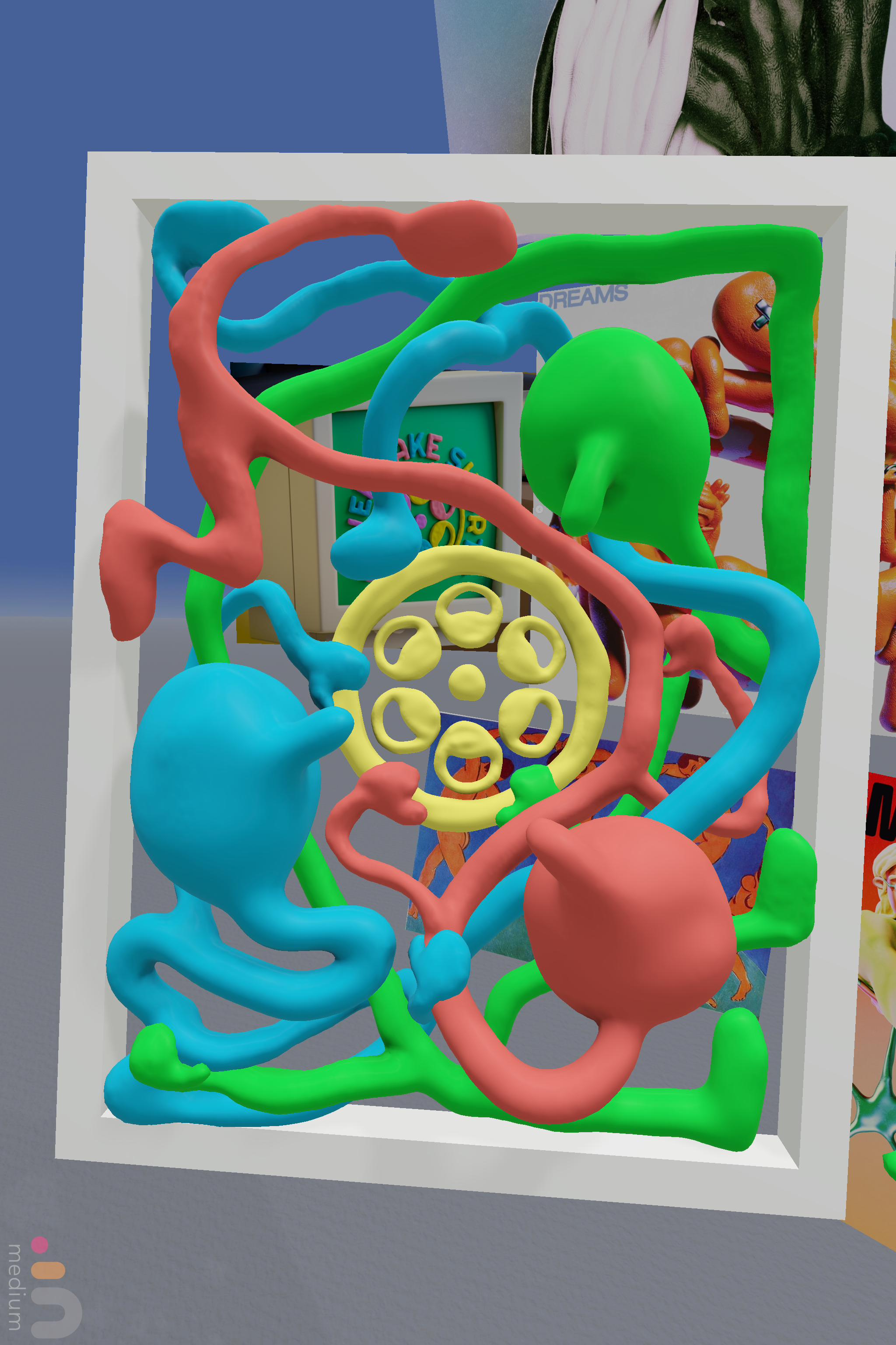
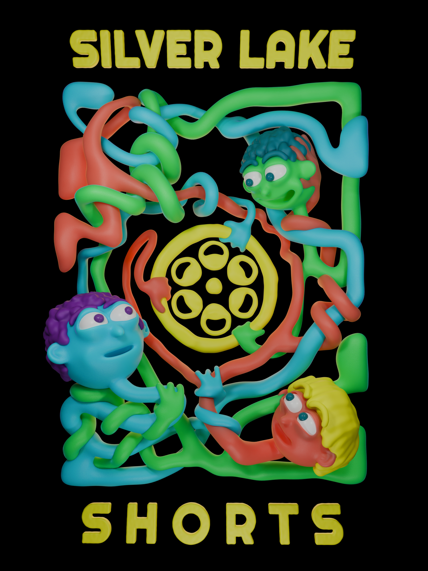
A T-shirt design I was commissioned to make by Silverlake Shorts. I wanted this piece to capture one of my favorite parts of Silverlake Shorts, which is the community aspect. After playing around with several design ideas, I settled on having a few characters, based off of my character that features in the “Endless Office” interstitial that plays every month, wrapped around the Silverlake Shorts logo and each other, hugging and smiling.
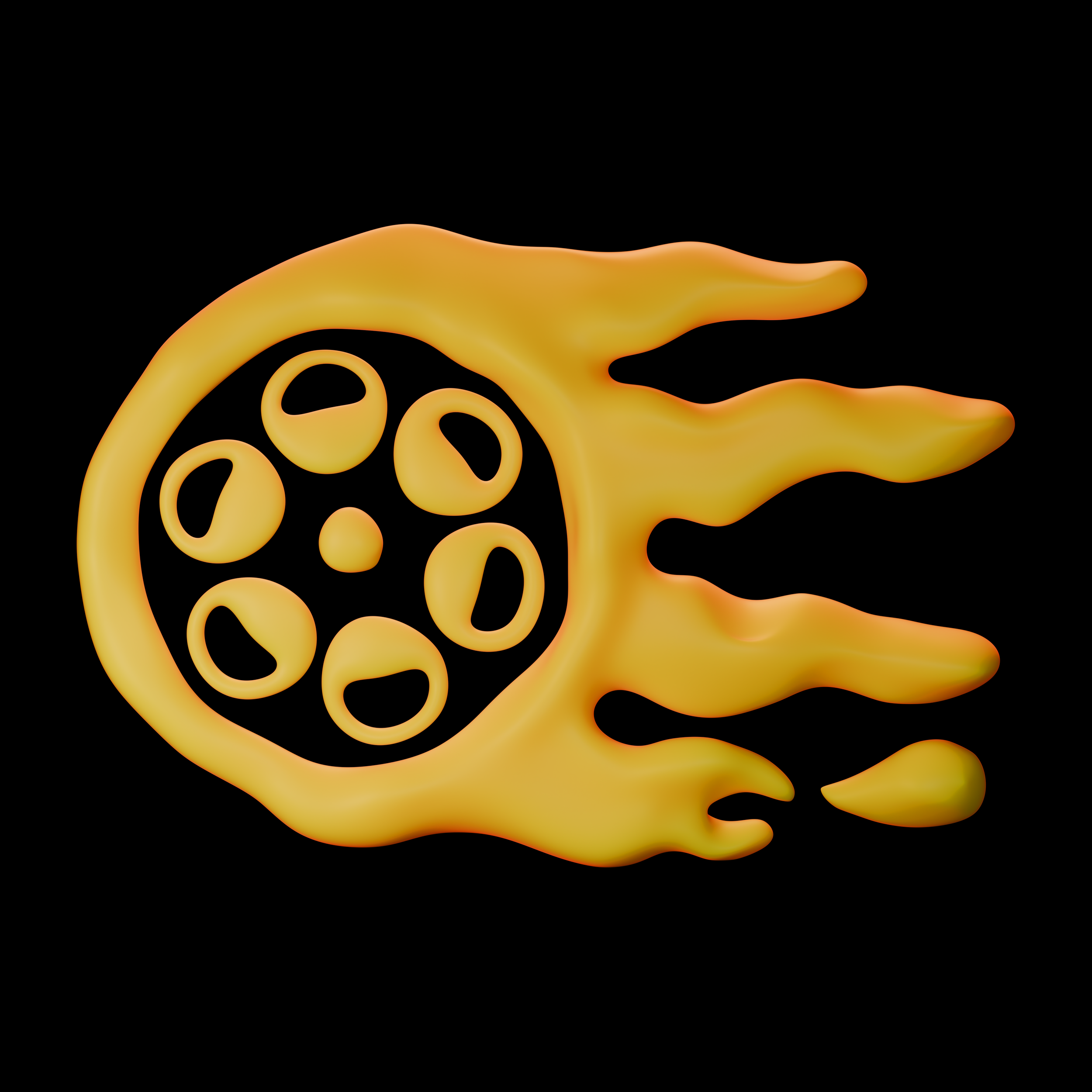
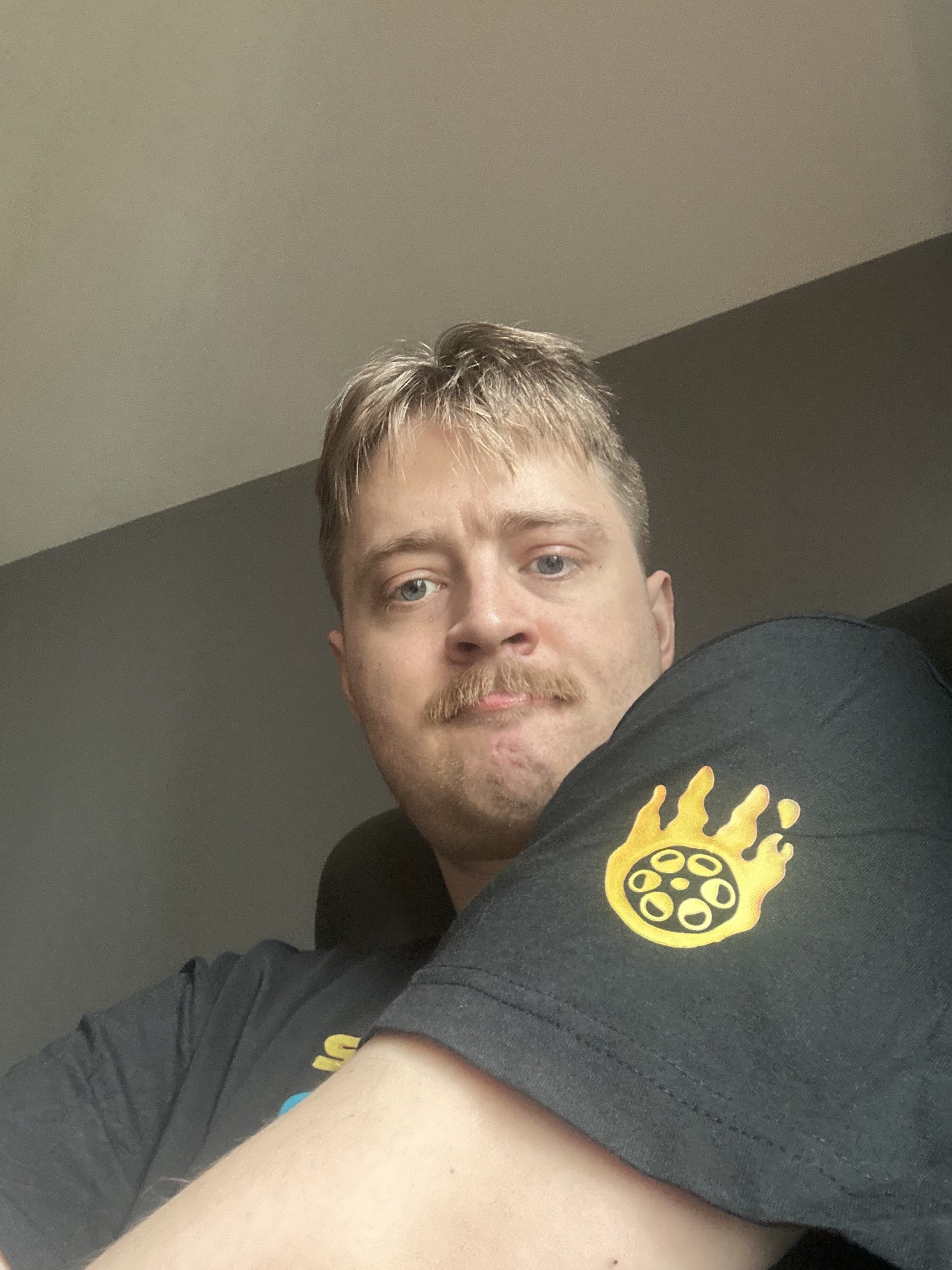
The sleeve design. It’s a play on the Silverlake Shorts logo, turning it into a flaming smear frame.
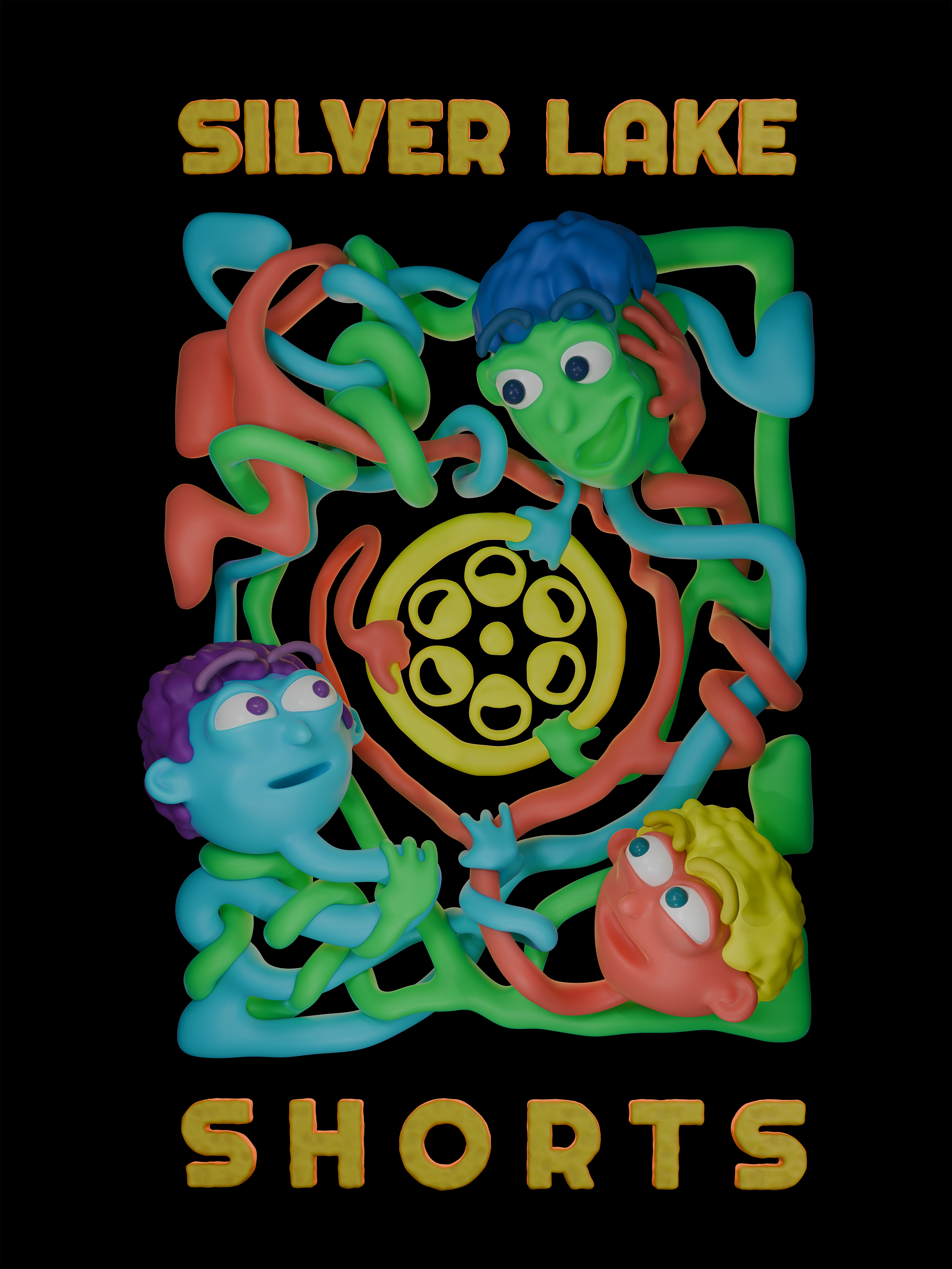
A very rough little mockup I made that I sent over to the printing guy to make sure the sizes and positionings of the design were how I imagined them.
Behind the Scenes
My first thought was to jump straight into VR and start sculpting an idea I had in my head.
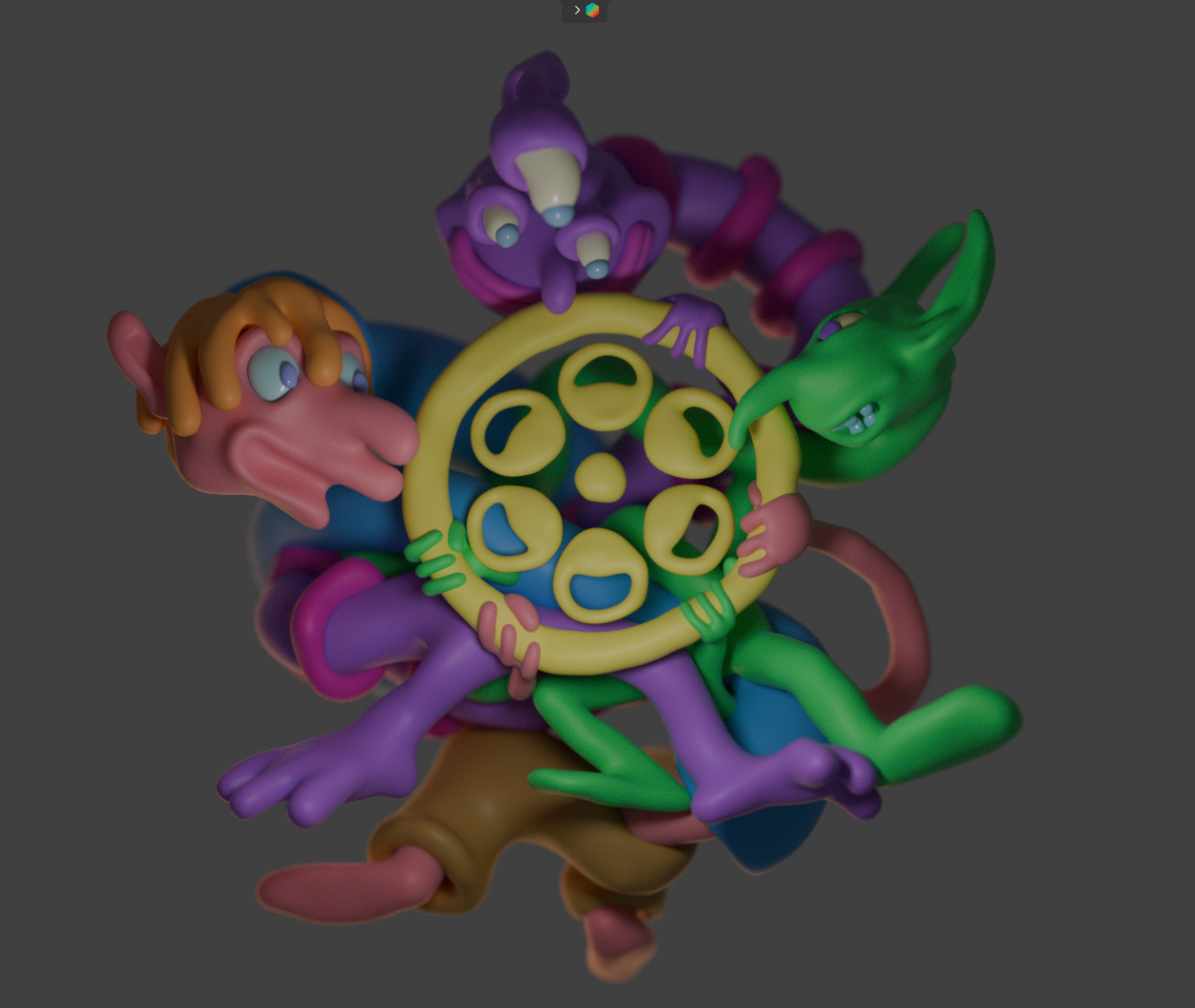
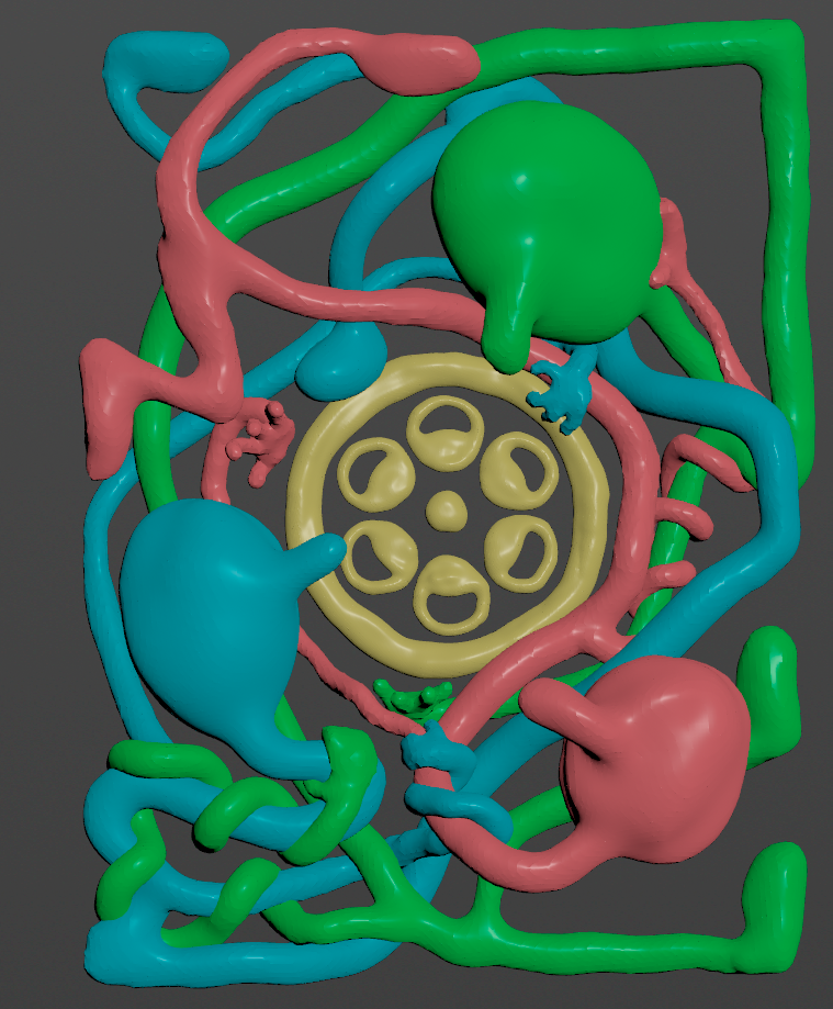
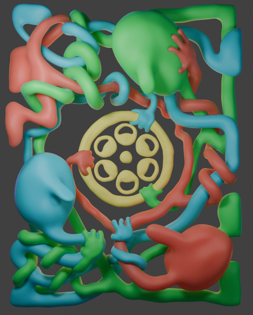
My first design idea. I was playing with different characters being entangled, but it felt too cramped and I didn’t love any of the character designs. After looking at it and getting feedback from several friends, I decided to try and incorporate the logo into the center as a way to push them apart and introduce more negative space.
This was another iteration on that first idea. I added in the Silverlake Shorts logo and moved the characters around a bit. I liked it, but still didn’t love the characters. I decided it would be best to try something new from scratch.
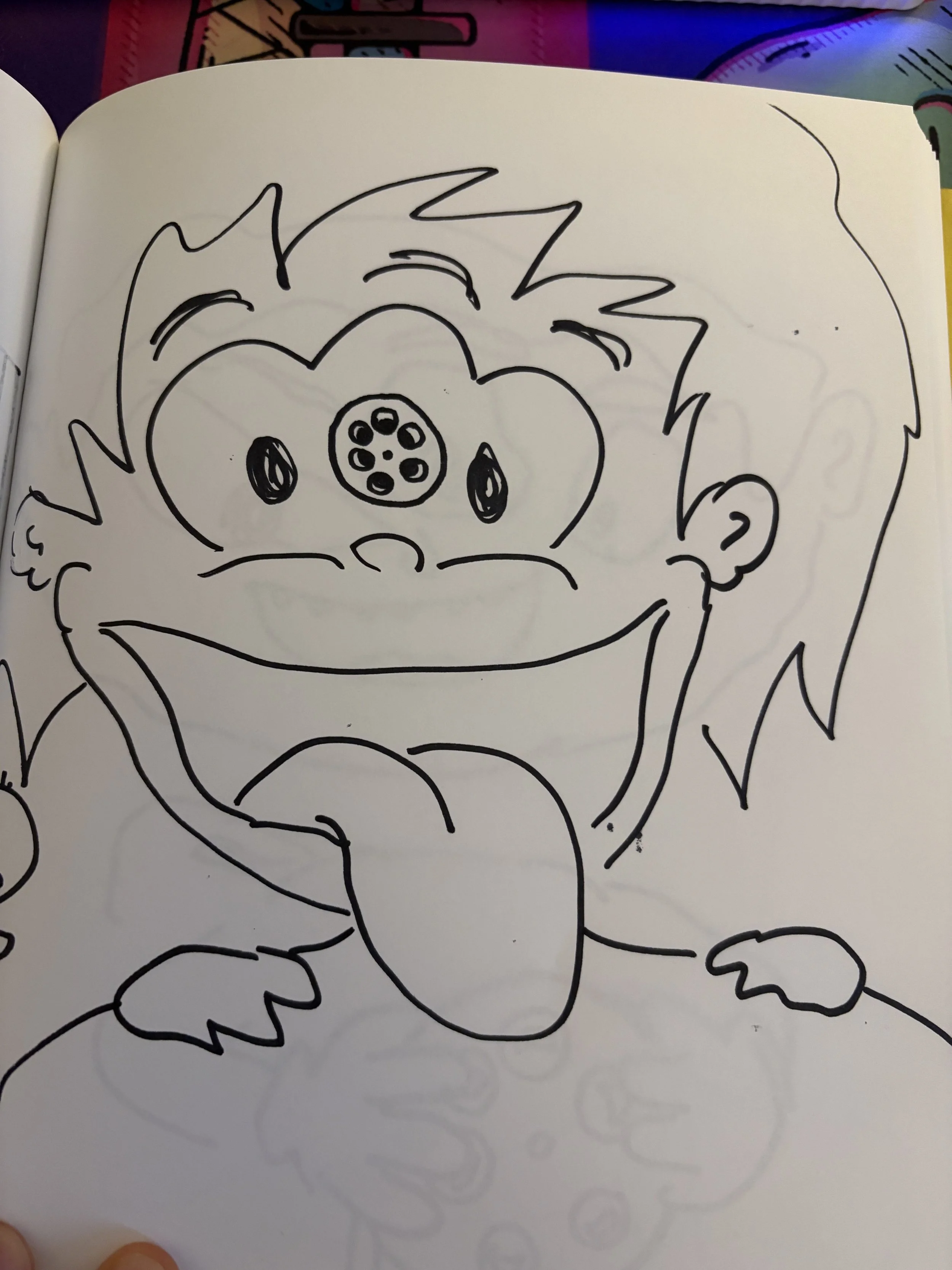
At this point, I started playing with different sketches (see below), but none of them were really sticking.
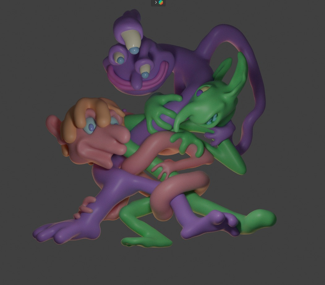
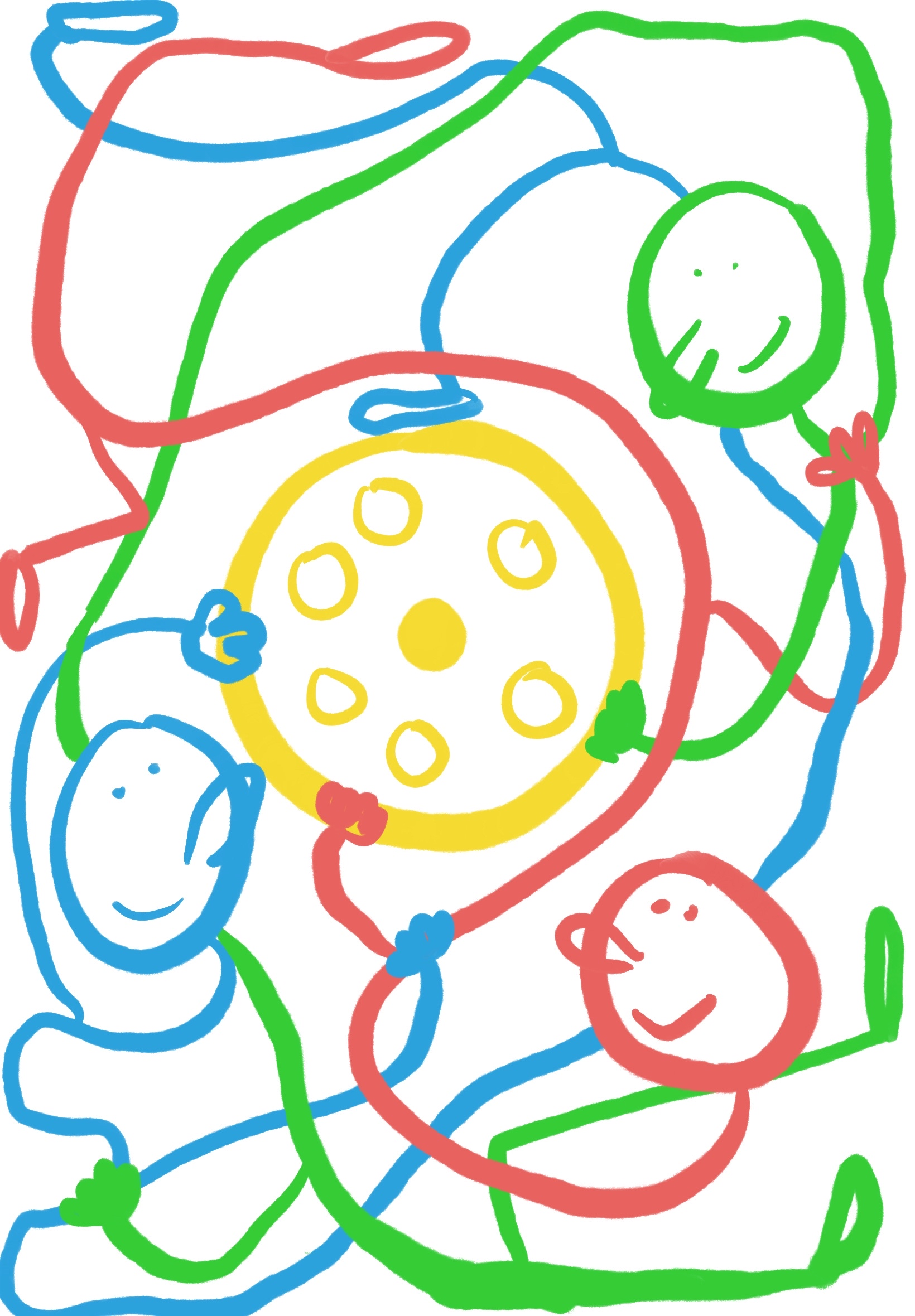
Then I had another idea, one that was closer to the original “entangled” idea I had. This sketch ended up being the concept for my final piece. I made two versions — one featured a 4th purple character, and the other was if I decided to stick with just 3.
From here, I jumped back into VR, and began blocking stuff out. I decided to try and lock in the blocking first before figuring out what the characters looked like or adding in details, that way I could get a solid sense for the composition before anything else. What follows is a LOT of different iterations on the blocking.
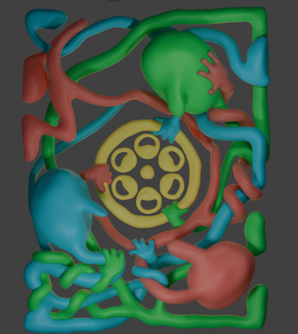
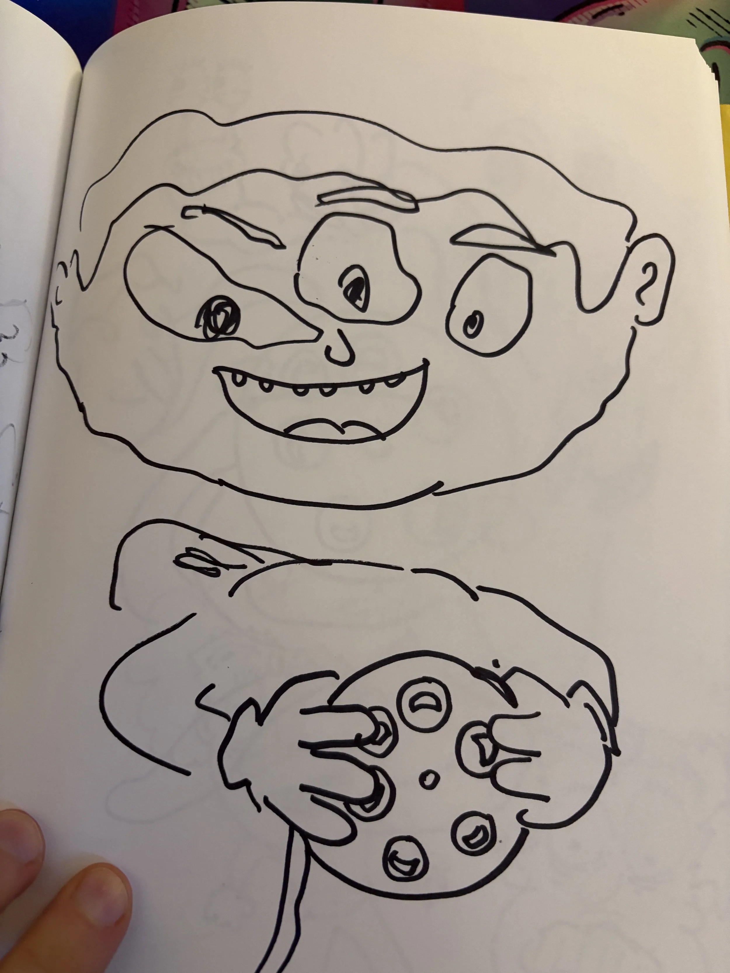
Once I was pretty satisfied with the blocking, I started trying different character designs. It took me a bit before I settled on a final. Here are some of the different iterations.
It has some charm, but overall it felt too simple and bland, and the red character’s mouth unfortunately looks way too much like the Amazon logo.
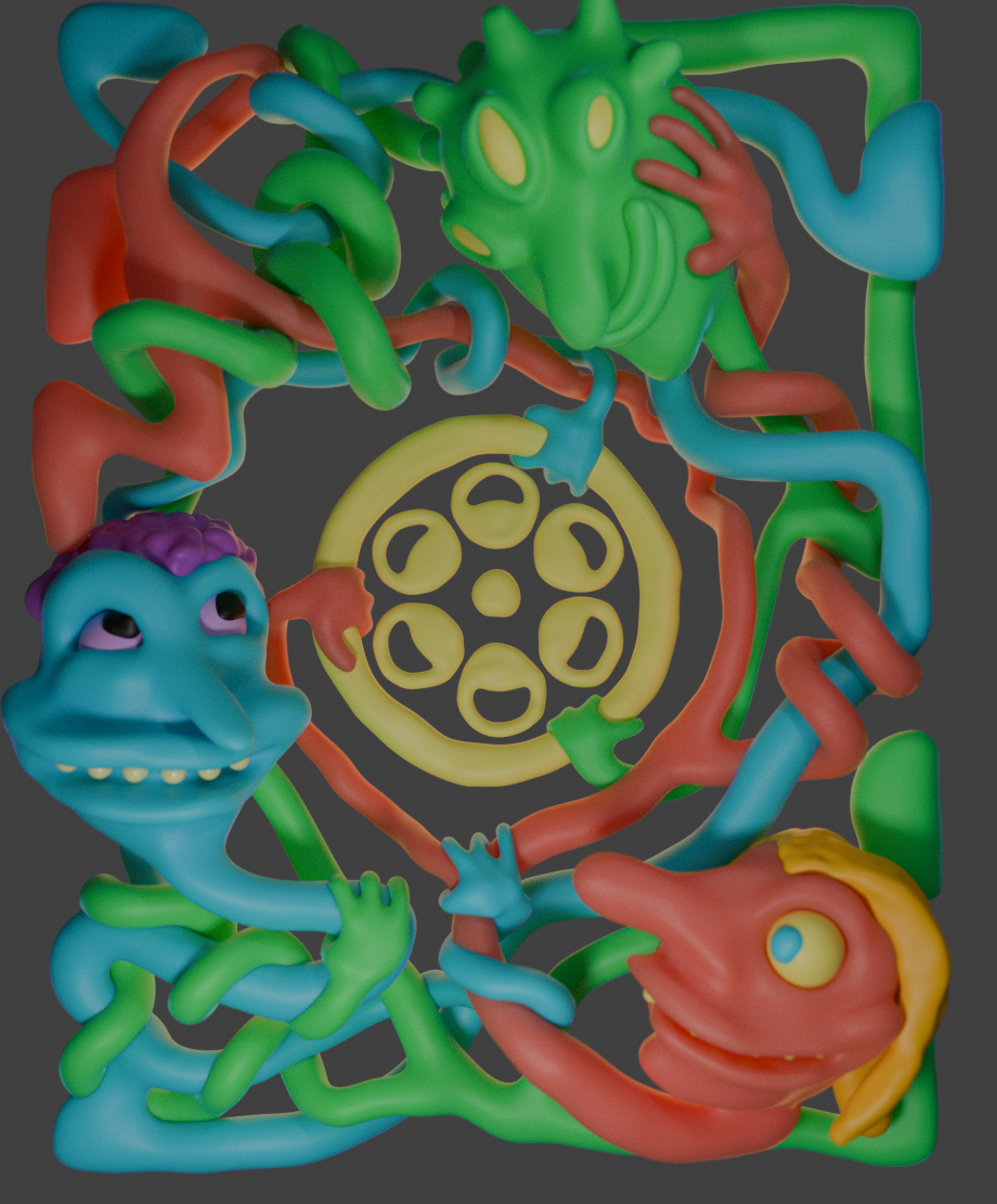
They’re all too creepy and feel very random. There’s no cohesion. The variety is fun, but ultimately didn’t really love any of these.
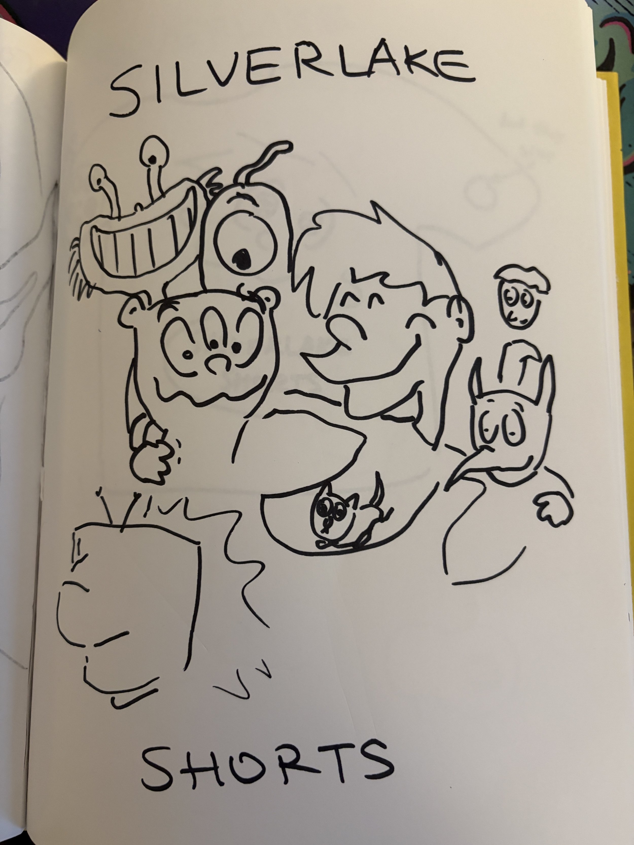
This was my first attempt at trying to use the character design from the Endless Office interstitial and tweak each one a bit. It was a good start, and I felt like I was finally on the right track, but I didn’t really love any of them yet.
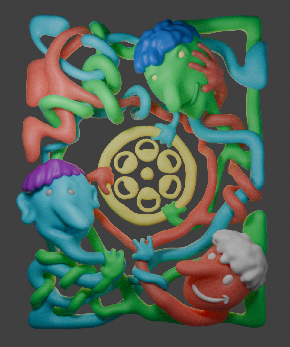
Here I felt like I swung a bit too far in the other direction. I liked that they all invoked Endless Office, but the red and green guys looked too similar and weird. It just didn’t really quite work. This was the final iteration before I landed on the final character designs.
The final! I ended up using the blue and red guys from the previous iteration and the green guy from two iterations back, changing the red guy’s hair, and making some small tweaks to the faces.
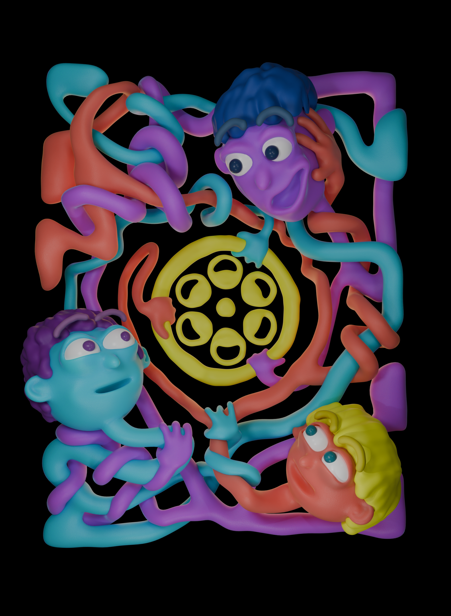
I also experimented with making the green guy purple, but ultimately liked the original color scheme better.
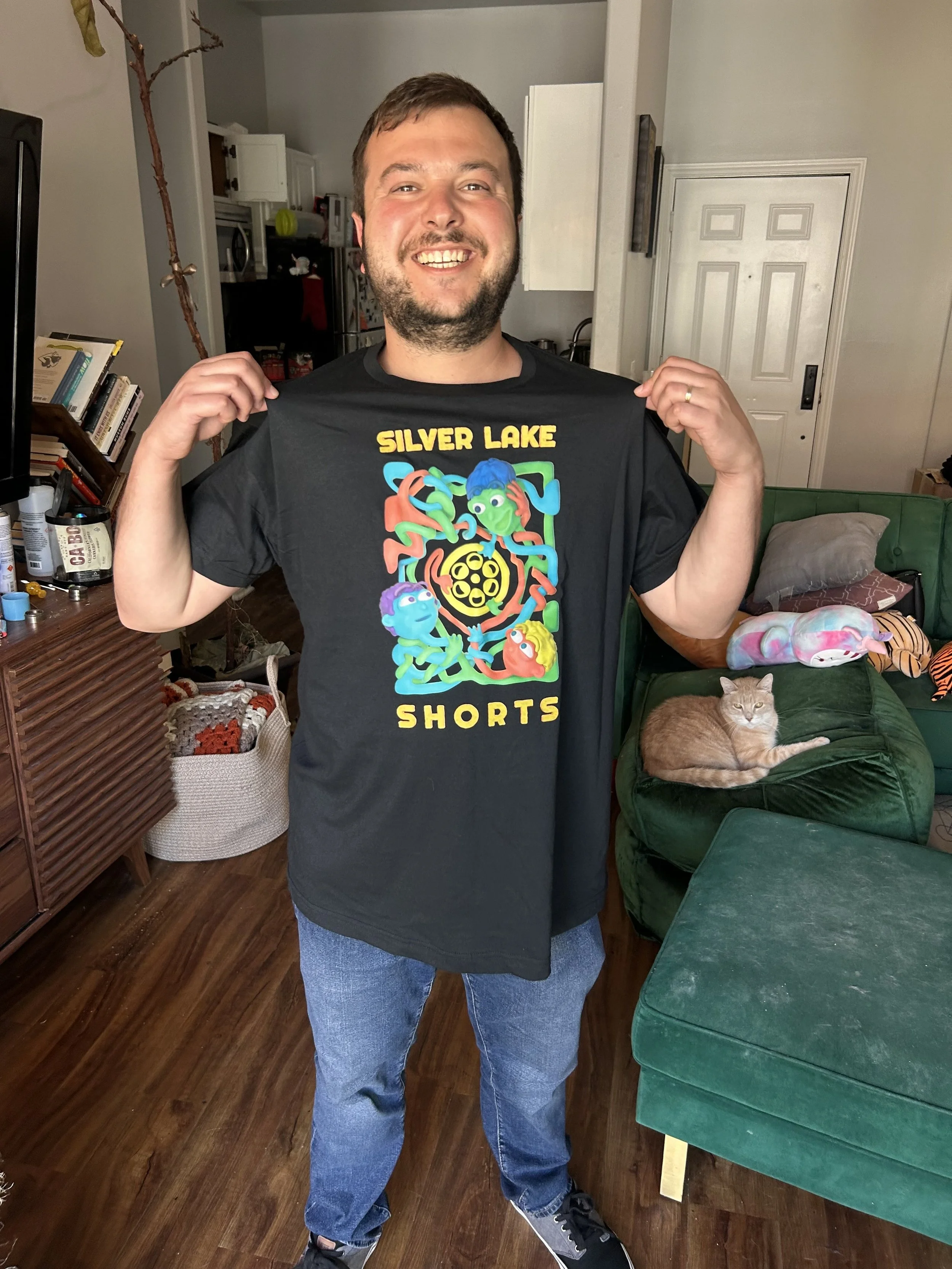
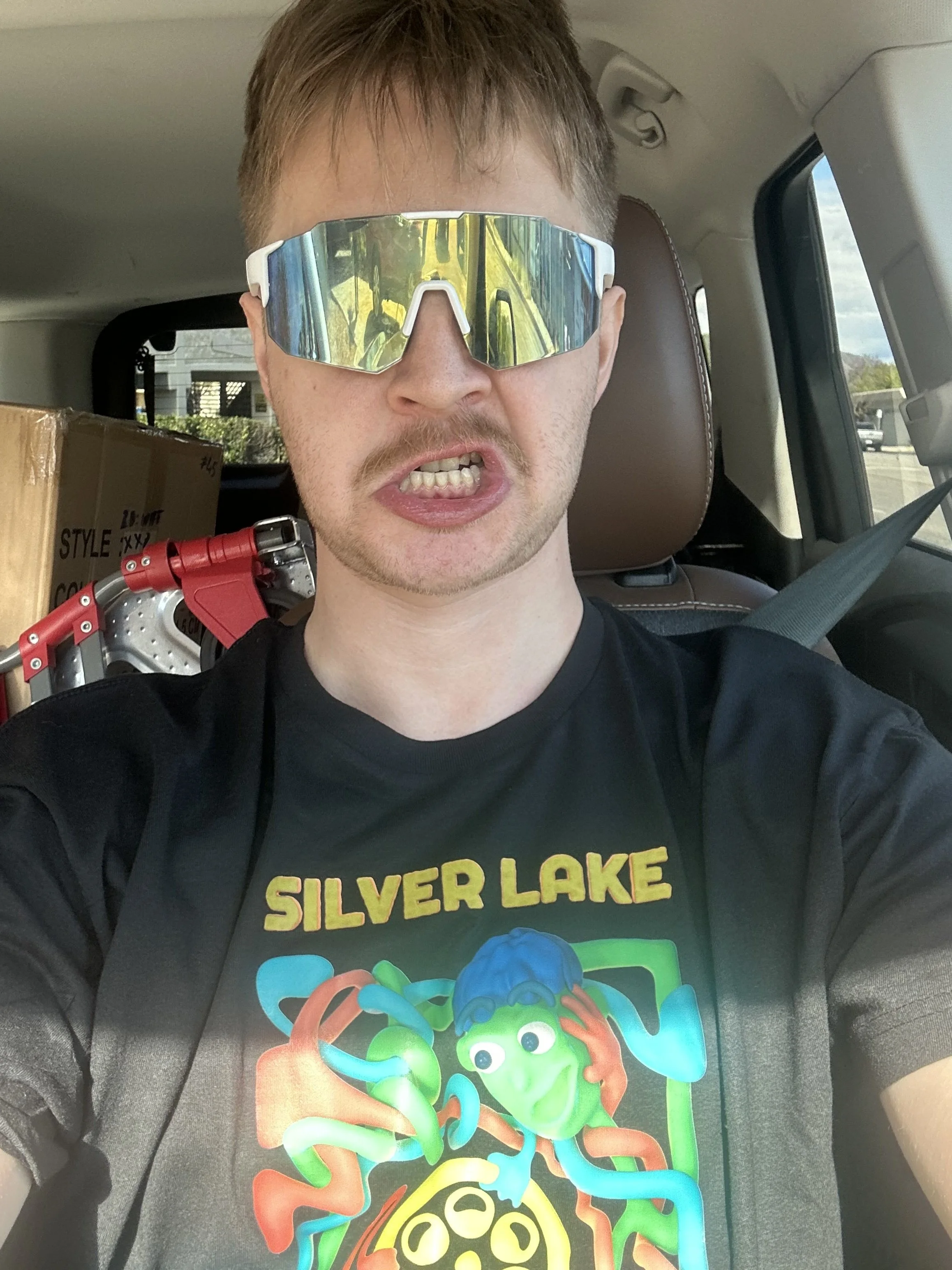
Some Lovely Pictures of Jared & Ben From Silverlake Shorts Modeling the Shirts!